WHY THESE COLORS
Posted by Beren McKay on Jul 2nd 2026
The Palette Decision
Why These
Colors
Years ago, while I was designing knives at SOG, one of our testers handed back a serious combat knife and asked if I could build him one in pink. I asked him to repeat himself.
He wasn't joking. Off duty, in plain clothes, that was the knife he'd actually want on him. His reasoning was simple: if he ever ended up in a situation where local law enforcement showed up, they'd see a pink knife and not give it a second thought. The color did something the blade itself never could. It changed what the knife meant to a stranger in a tense moment.
Then he said the thing I've never been able to unhear — that the perception of a thing carries far more weight than most people give it credit for. A man who carried a weapon for a living was telling me the most important feature on the knife wasn't the edge, or the steel, or the lock. It was what the object said about the person holding it. That conversation is the reason the MERINO MM is dark blue.
The Read
What a Knife Says
Before It Opens
Threat perception isn't a decision. It runs about half a second ahead of the conscious mind, sorting objects into categories before you know you're looking at them. And here is the part most people miss: the brain doesn't sort on what an object does. It sorts on what the object signals — color, profile, material, the aesthetic vocabulary the design is borrowing from. A blade can be the exact same blade in two different knives and read as a kitchen tool in one and a weapon in the other.
In the knife world, blades come in two finishes: silver or black. Both are completely standard. And black, in the visual language the modern eye has been trained on, sits squarely inside the tactical palette — the default finish of combat knives and military tools, the entire aesthetic of things designed for use against people. So if your knife reads as a weapon at the office, that isn't your coworker overreacting. They're reading the signal accurately. The knife is telling them what it's for.
The Real Problem
A knife that reads as a weapon is a knife you eventually leave home. The capability never failed. The signal did — and the signal is a design choice, which means it's a design problem, which means it can be solved.
The Decision
Engineering a Color
With No Category
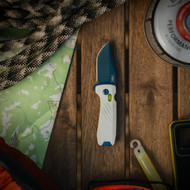
I needed a blade that borrowed from nothing — no military vocabulary, no tactical default. The MM's blade is coated in Titanium Nitride, and TiN can be shifted in color with heat. Push it through exactly the right temperature for exactly the right duration and you land on a deep, distinctive dark blue. But "exactly the right temperature for exactly the right duration" is doing enormous work in that sentence. The window is extremely narrow. Too hot or too long, too cool or too short, and you miss it.
The factory had never been asked to color-match a blade to that specification. At first they wouldn't attempt it — holding that consistency across full production runs seemed unrealistic. It took six to eight months of development to make the dark blue repeatable: knife after knife, batch after batch, the same blue. The result is a blade color that had never appeared on a production knife before — which is exactly the point. When the eye meets it, there's no existing category to file it into. It doesn't read as tactical. It reads as chosen.
of development to make the dark blue repeatable at production scale — a blade color that had never existed on a production knife before.
The blue was the hardest decision, but it wasn't the only one. Each color in the palette is doing a specific job, pulled from a world that has no association with weapons at all.
-
Dark Blue
The foundation. Heat-shifted TiN, sitting nowhere near the tactical palette. The color that gives the brain nothing to file under "weapon."
-
Safety Yellow
Borrowed from the outdoors. Dark blue and safety yellow is a combination you've seen on water bottles, rain jackets, and packs a hundred times. The outdoor industry owns it. Nobody has ever associated it with a weapon.
-
White
The consumer-goods signal. The color of kitchen appliances, medical devices, household tools. It lightens the whole read and adds the contrast that makes the knife look considered — more design-store than tactical-catalog.
Put the three together and the fast, pre-conscious categorization has nothing to work with. No tactical signal anywhere. The reading comes out: tool.
What It Means For You
The Desk Test
Here's where all of it lands. A package arrives. You take the knife out, open the box, put it away — and the conversation in the room keeps going. Nobody steps back. Nobody's expression changes. There's no moment where you feel you have to explain yourself. The knife came out and it was a non-event, the way it would be if you'd reached for a pair of scissors.
That's not a small thing. The whole point of carrying a knife is having one when you need it, and the fastest way a carry fails isn't the blade or the lock — it's the social cost of taking it out in the rooms where you spend your day. Solve the signal and you remove the reason the knife slowly migrates to the dresser. This is carry-first design pushed one step further than the pocket — out into the room, into the half-second before anyone has decided anything.
A tester asked me for a pink knife and accidentally handed me the brief for an entire line. He was right about the thing that matters most: people read the object before they read the person. The least I could do was make sure the object told the truth.
Beren